In continued support of the TransitMatters mission to unite advocates and inform the public about the state of the MBTA system, TransitMatters Labs is pleased to announce that bus data is now available and ready for exploration in Data Dashboard 3.0.
The Data Dashboard carries a storied history. Our work on its first version began in 2019 with the objective of providing an easy-to-use web site to explore travel times, time between trains (headways), and time spent at stations (dwell times) for trips on the subway network. The dashboard’s update in 2021 began computing statistics on those metrics over time, allowing for analysis of longer-term system trends. We’re thrilled that updating the Data Dashboard to version 3.0 with support for MBTA buses means that both transit advocates and the public can scrutinize the bus network nearly as much as the subway. It is also incredibly significant for TransitMatters itself—it enables our campaigns and our partners to study the performance of bus routes to make better informed policy recommendations.
To view the new bus data in the Data Dashboard, head over to https://dashboard.transitmatters.org. There is a new slider to switch from Subway over to Bus in the top-left corner:

Switching the slider to “Bus” changes the Dashboard to a yellow theme—that’s how you know you’re ready to dive in. Select a route, an origin station, a destination station, and a date (or date range) to continue. Bus data is available from August 1, 2018 through November 30, 2021 on the following routes:
1 - Harvard Sq to Nubian
15 - Fields Corner / Kane Sq to Ruggles
22 - Ashmont to Ruggles via Talbot Ave
23 - Ashmont to Ruggles via Washington St
28 - Mattapan to Ruggles
32 - Wolcott/Cleary Sq to Forest Hills
39 - Forest Hills to Back Bay
57/57A - Watertown Yard / Oak Sq to Kenmore
66 - Harvard Sq to Nubian
71 - Watertown Sq - Harvard
73 - Waverley Sq - Harvard
77 - Arlington Heights - Harvard
111 - Woodlawn - Haymarket
114/116/117 - Wonderland - Maverick

Unfortunately, buses don’t collect the information we need to compute dwell times (time spent at stop), so these are the three metrics available for bus:
Travel times
Time between buses (headways)
Travel times by hour - choice of weekdays or weekend/holidays
After selecting input parameters, the Data Dashboard then presents you charts for those metrics. Here is an example from Route 1:
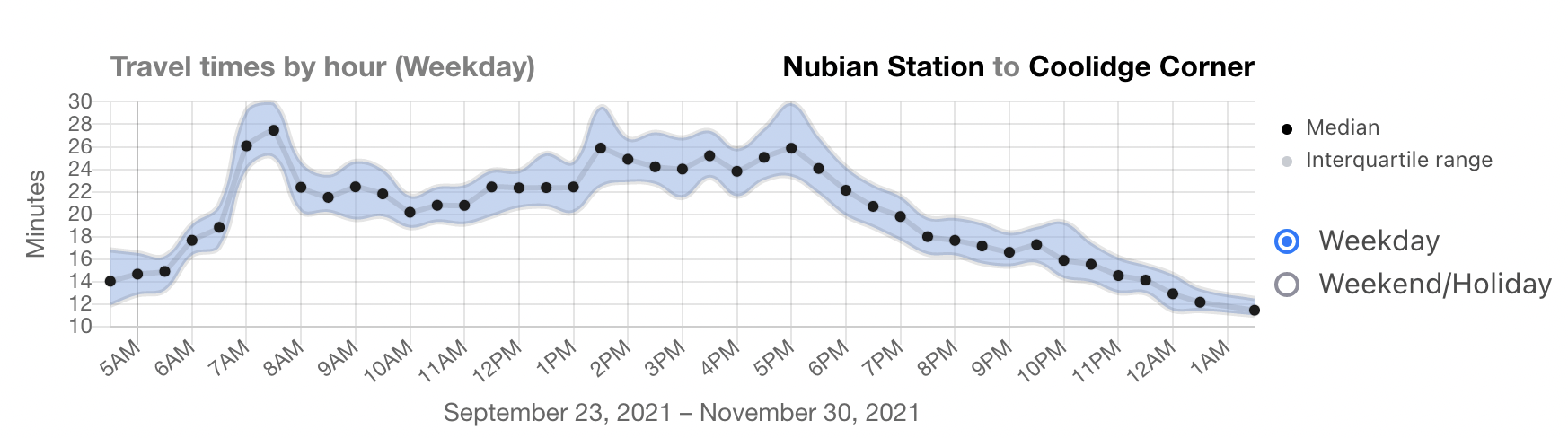
You may notice the interquartile range is often larger than you would see for the subway. This is because buses are generally more variable, since they are more susceptible to factors like traffic, which changes throughout the day. To help dive into this phenomenon more closely, we added a new type of chart:
This “Travel times by hour” visualization helps clarify the variability shown in travel times above: mid-day trips (especially during rush hour!) are much slower than early morning and late-night. We also added an option to view weekend averages here as well.
This data makes some bus network challenges incredibly clear, such as headway management and bunching. For example, here is evidence of bunching on Route 1 at Putnam Avenue, near its western terminus at Harvard Square. On this day, September 23, 2021, bus frequency fluctuated between 1 minute and almost 30 minutes, particularly in the middle of the day. This may be due to data collection issues (if a bus running on Route 1 had a faulty GPS locator, for example). However, in this case, the average is a bus every 12-15 minutes, giving credence to the bunching scenario over the “missing trips” hypothesis.
These charts also show how bus lane installation can greatly affect the rider experience. After the City of Boston’s installation of the center-running bus lane on Columbus Avenue, Route 22 travel times during the evening commute dropped from 14 minutes to 10 minutes.
Before bus lane installation (October 2021):
After bus lane installation (November 2021):
We’re incredibly thankful for MassDOT’s Office of Performance Management and Innovation (OPMI); they consistently publish bus departure data that we use for this feature in the Data Dashboard. This update would not be possible without the hard work of everyone there and at the MBTA.
TransitMatters is looking forward to seeing what the community finds in Data Dashboard 3.0. Check it out! We also continue to appreciate your questions and feedback, and heads up—we’re always looking for volunteers with skills in web programming, data wrangling, graphic design, and fun :-) The TransitMatters Labs team is reachable at labs@transitmatters.org. You can also follow or tweet at some of the team members who worked on this project on Twitter:
Austin Paul (@ajp5678)
Chris Schmidt (@crschmidt)
Preston Mueller (@mathcolo)
Nathan Weinberg (@Nathan_Weinberg)
Chris Friend (@friendchristoph)